
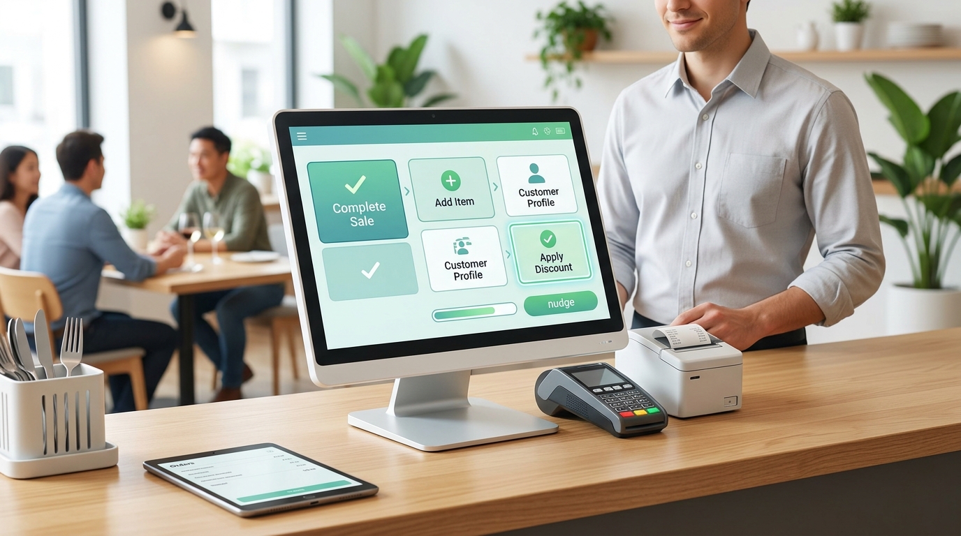
During peak service, front-of-house cashiers process hundreds of customized orders while managing high noise levels and customer expectations.
When point-of-sale (POS) systems feature bloated menus, deeply nested sub-menus and confusing button layouts, cashiers suffer from severe cognitive overload. Over time, this constant friction leads to high error rates, slow ticket times and cashier burnout.
By applying Nudge Theory — a concept rooted in behavioral economics popularized by Richard Thaler and Cass Sunstein — to POS choice architecture, software designers and restaurant operators can subtly guide cashier decisions, eliminate mental friction and preserve staff energy.
Understanding the Cognitive Load on Cashiers
Every tap, scroll and menu search on a screen costs mental energy. When cashiers are forced to make dozens of micro-decisions per transaction, cognitive fatigue sets in quickly.
| THE CAUSE & EFFECT OF POS FRICTION |
| POS UI flaw | Operational impact |
| 15+ uniform buttons | Visual clutter; delays search speed. |
| Nested sub-menus | Multi-click fatigue & missed upsells. |
| Manual modifiers | Higher order entry error rate. |
When systems force staff to perform repetitive, complex navigation during high-volume rushes, industry studies on hospitality stress show that chaos and poor tool design directly accelerate staff burnout and turnover.
Four Nudge Architecture Tactics for POS Interfaces
Nudging does not force actions. Instead, it makes the most efficient, logical decision the easiest path of least resistance.
1. Dynamic layouts based on daypart data
Static POS layouts present the entire menu at all times, forcing staff to scan through irrelevancies.
- The nudge: Configure screens to dynamically surface top-selling items based on the active shift.
- The result: Morning shifts display coffee, breakfast sandwiches and pastry add-ons prominently. Evening shifts automatically foreground dinner entrees and drink pairings.
2. Color-coded visual anchoring
Monochromatic interfaces force cashiers to read text labels repeatedly throughout their shift.
- The nudge: Assign distinct visual colors and shapes to high-frequency categories (e.g., green for beverages, blue for mains, amber for modifications).
- The result: Cashiers rely on peripheral visual memory rather than active reading, cutting transaction time per order.
3. Smart prompting for modifiers (preventing decision paralysis)
Manual prompting requires cashiers to memorize every required modification (meat temperature, dressing choice, side options).
- The nudge: Build forced, single-layer pop-ups that appear only when an item requires customer choices.
- The result: Eliminates forgotten details without flooding the primary interface with unused buttons.
4. Predictive upsell placement
Instead of burying upsell options or forcing staff to scroll through secondary tabs, integrate smart contextual recommendations into the core checkout flow. According to research on workplace behavioral nudges, structured choice environments guide staff toward ideal workflows seamlessly without increasing anxiety or fatigue.
Designing for Ergonomics and Mental Energy
POS INTERFACE COMPARISON
| Traditional POS UI (High Friction & Fatigue) | Nudge-Engineered POS UI (Low Friction & Fast Flow) |
| Uniform button sizing Monochromatic color grid Deeply nested sub-menus Static layout across shifts Requires manual reading | Top sellers enlarged 2xColor-coded by category Single-tap popup modifiers Dynamic shift-based menus Guided by visual memory |
To create an interface that protects cashier well-being:
- Use Fitts’s Law: Make high-frequency buttons (like “Pay Cash” or “Send Order”) larger and position them near natural hand-resting positions.
- Limit choices per screen: Keep interface options to a maximum of 7–9 choices per view to avoid visual overwhelm.
- Automate defaults: Set the most common modification as the pre-selected default (e.g., “Regular Milk” or “Dine-In”).
Small UI Tweaks, Massive Retention Gains
POS interface design is far more than a software aesthetic; it is a critical workplace environment factor.
By designing screen architecture around human cognition, restaurant operators reduce shift fatigue, lower costly entry errors and build a calmer, more sustainable front-of-house work environment.